Or is a common heraldic tincture. Flattened by the RGB spectrum into a bright yellow (hexadecimal code #FFCC00), it was once drawn as a slightly duller, olive-brown (#CFB53B). Or is symbolic of faith, of generosity, of glory, and is often deployed in art and heraldry to signify a celestial body – the sun, for instance. Azure, the heraldic term for a rather plumb and even shade of blue (#003399) has similar virtues, often used to denote constellatory space. These two particular colours constitute the current flag of the European Union.
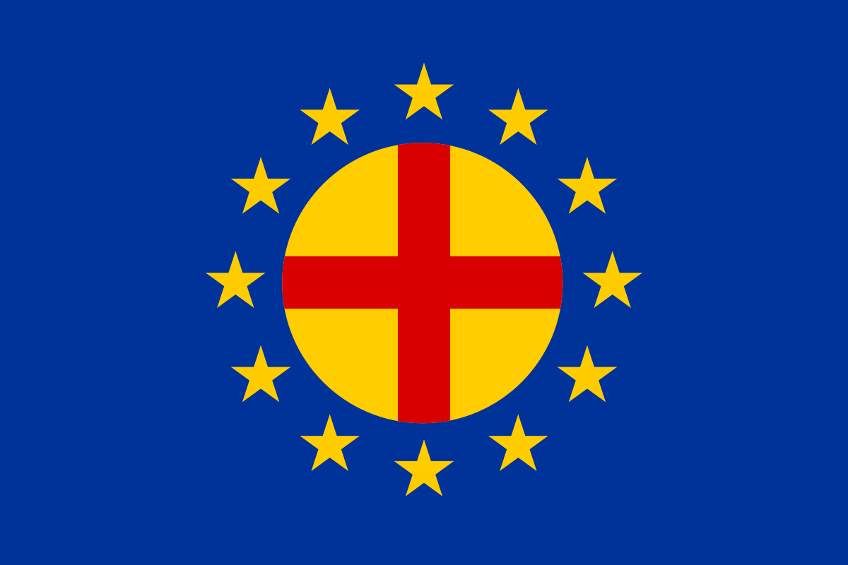
Assigning colour to a concept is a tried-and-tested formula for constructing a sense of continuity. When Richard Nikolaus Eijiro, Graf of Coudenhove-Kalergi—an Austrian-Japanese political activist and Bohemian European aristocrat—proposed the “International Paneuropean Union” in 1923, he also submitted a flag design to bind the cause: a circle of Or with a sun cross—an astronomical symbol which has since been separately adopted by Fascist movements worldwide—in a tincture of Gules (red), set against a field of Azure. (Deemed to be a political threat, Coudenhove-Kalergi’s movement was outlawed by the German National Socialists in 1933 and later reformed after the Second World War.)
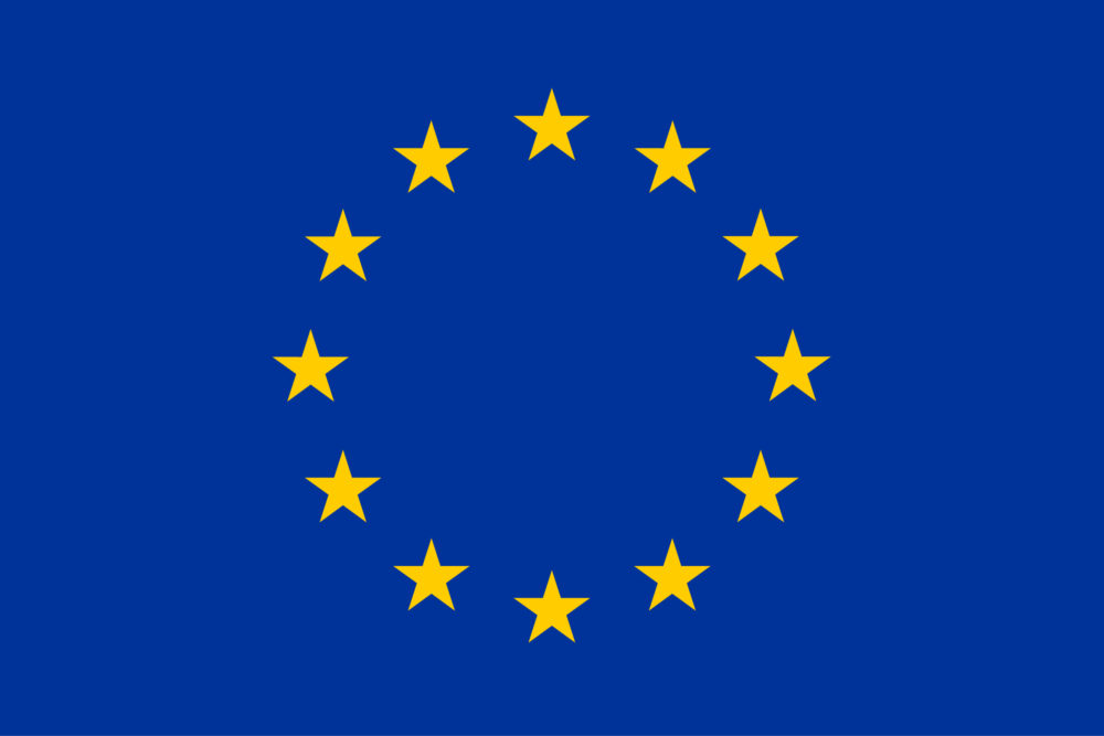
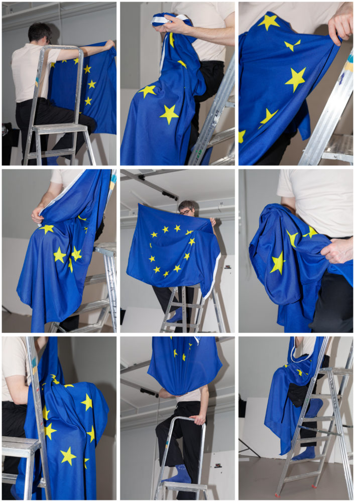
Unless understood as part of a billowing lineage, the flag of the European Union adopted by the current political framework—which comprises twelve stars in Or against a field of Azure—is almost totally irrelevant to its original meaning. Its design was conceived through competition for the Council of Europe in 1955, and touted as a possible symbol for the forthcoming Union at the Brussels World’s Fair of 1958, before finally being enforced across EU member states in 1985. The number of stars are as arbitrary as the ideas now ascribed to them: they “stand for the ideals of unity, solidarity and harmony among the peoples of Europe,” while their circular arrangement is “a symbol of unity.” Cursory research presents a smörgåsbord of superficial interpretations: the twelve Apostles, the halo of the Virgin Mary, the signs of the Zodiac – even, oddly, the months of the year. But it is this very torpidity, balanced by a carefully constructed universal blandness, that has allowed it to endure.
The mark of any competently designed flag is an intelligence of colours and shapes that can be locked into a relevant history or ideology, invoking something far greater than the sum of its parts. But it’s crucial test (ask any Vexillologist) lies in its “belovability” – can it, in other words, harness and continue to gather meaning, while weathering the political and territorial sands shifting beneath?


Nostalgia has a part to play. When New Zealand unveiled their crowd-sourced designs for a new national flag in 2015, the choice in their two-part referendum was, it seemed, clear: out with the Blue Ensign of the British and all the Imperial associations it embodied, and in with a more progressive and representative emblem of a diverse and independent nation. Not to mention, some argued, it just looked far too similar to that of Australia’s. But when it came to the final round, voters indicated a clear preference for the status quo. The majority valued a particular narrative of national heritage suggested by the existing flag and, by extension, the sense of continuity it afforded – real or imagined.
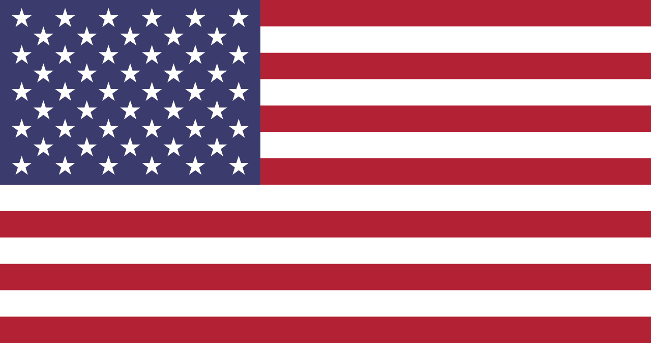
Compare this with the “Star-Spangled Banner” of the United State – a country above all others in its demonstration of keen commitment to a flag, and the notion of a national identity. While the meaning behind the original message of the stars and stripes may have evolved since its foundation (I wonder, for instance, how many look at it today and consider the thirteen British colonies that seceded from the Kingdom of Great Britain in 1777?), its representational power is just as potent.
And so, just as it’s near impossible—if so inclined—to tear yourself away for good from the family that you’re born into, love for your flag, and what it says about you, is surprisingly unconditional. As individuals, we’re governed by fewer imposed identities than our grandparents, but our national identity and their preordained symbols stands fast – bound inextricably to our native tongue, our core right of residency, our sense of self-positioning, our overlap (or lack thereof) with people we do not know. It binds us to some and disinherits us from others, be it in the spirit of sportsmanship or the wilful act of conflict and aggression. There are few symbols able to cast such an immediate supra-identity over an individual, whether they subscribe to it or not, and which evoke in most the duty to defend.
The Or and Azure (the “Star-Circled Banner”?) stands apart from this trend. In a non-federalised Europe, the EU flag does not have precedence over that of each respective country. It’s remarkably rare to find someone flying it on their property, for instance, and it is almost never printed as a symbol in Passports. As a citizen of a state, you are obliged to renounce certain freedoms in order to be granted the protection of a higher elected authority; that elected authority, for the largest proportion of current European Citizens, is not yet the European Union. Localised politics remain the order of the day – ask anyone if they voted for their local MEP (Member of the European Parliament), let alone their name, if validation is required. The opening clauses of Brussels—A Manifesto (2004) outlines the key underlying reasoning behind this phenomenon—that the ‘Idea of Europe’ lies in “the sheer struggle between unity and multiplicity, […] embodied by each political vision that has addressed it.” This dialectic remains, until now, spectacularly unresolved.